Do you struggle with how to style a bookcase? You're not alone. Many desire a Pinterest-worthy bookcase but aren't sure where to begin. This post includes illustrated instructions on how to style a bookcase, as well as some links to some of the decor seen on this page. Click here to see another post I created with some additional decor that's great for styling bookcases.
Bookcases aren't just for storing your books. They are a great way to enhance the aesthetic to a room if you choose the right decor for the shelves, as well as the proper placement for those decor accents. They can also be a great place to display your treasures, such as family photos. As a stager, I sometimes use bookcases to fill empty wall space in large rooms when I've already hung enough art. Staging with with bookcases can also demonstrate to potential buyers ways to add more storage space in bathrooms, kitchen, and other rooms.
The simplest and most fool-proof way to style a bookcase is to start by placing the largest items of a similar color in a zig-zag pattern as seen below. Then, taking another set of similar items and placing them in an opposite zig-zag pattern. The third step is to fill in with smaller items, if needed (and it's often really not needed). Resist using any decor smaller than a softball. Especially if you're staging a home to sell, because anything smaller than that isn't going to make any impact in the professional real estate photos used to market the home. Even when not staging, a bunch of small items begin to create a cluttered look. So, again, avoid using items smaller than a softball or grapefruit unless it's a treasured item that you really have your heart set on displaying to everyone who enters the room.

In the photo on the left, white items or groupings have been placed in a zig-zag pattern.
In the photo on the right, plants (green items) or groupings have been placed in an opposite zig-zag pattern.
The photo on the right would be enough decor for staging a home. In fact, it would be perfect. It's clean, simple, and has a neutral color palette. It's also incorporating nature (the plants) which every well-designed room should, and every potential buyer wants to see in a staged home. It doesn't matter if the plants are real or fake. We humans just have a very positive reaction to seeing representations of nature brought into the home.
If you like the function and look of the wall-mounted bookcase above, there are several style and size available on Amazon for purchase, including this one.
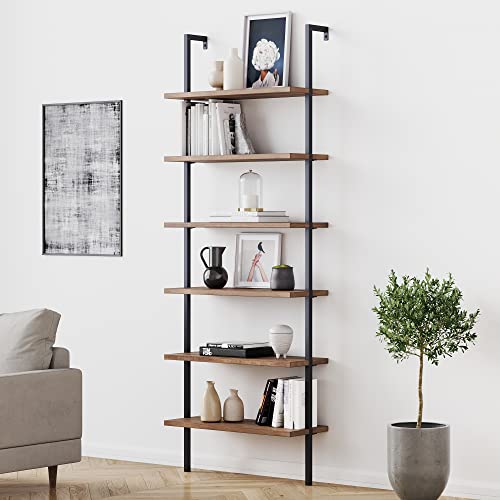
The photo below is a bookcase I used to stage a master bathroom that had extra wall space, but not a lot of built-in cabinets or drawers. In fact, the spot where I placed this shelving unit was a perfect spot for construction built-in shelving or cabinets, but my client declined to add those. So as a stager, it was my job to show buyers who would be viewing the home the potential for that space, whether with a free-standing shelving unit like the one I used here, or by constructing built-ins themselves.

Notice how I kept it simple, not just to make staging faster, but to keep it easy on the eyes and not cluttered-looking. I intentionally used decorative storage boxes to show home buyers how they could use a shelving unit in this space for more storage in the bathroom. The plants are for aesthetic purposes, but if necessary, it should be obviously to buyers that they can store additional items, such as towels, in those spots. By the way, this is the Loring bookcase from Target, and I bought all the little plants from Target, as well. The fabric black boxes are from IKEA, but there are a large variety to choose from on Amazon, like the ones below.


Don't be afraid to group things together as "one" item and count that as one of your "zigs" or "zags". For example, the tan wooden vase and the white arch placed together is one grouping, and the white tissue box and tan wooden knot is another grouping.
Notice in this image that a consistent color palette was used again, which is what makes it pleasing to the eye. Also note that the books in the bottom right corner were covered in kraft paper to get them to match the color palette.
Remember how I advised against using bookshelves to store your small trinkets and treasures? Well, decorative storage boxes like the wooden ones shown here can serve as a great place to store those items while still making them easily accessible.


Books can be covered in any color paper, but it's best to use a heavy stock. You can also just reverse the book jacket to expose the blank white side, if it's still with the book.
When I first started staging, I wrapped dozens of books, but soon realized all the packing and moving makes the paper look worn very quickly, so now I just shop thrift stores for books with neutral covers.


The zig-zag method isn't mandatory. You can get away with not using it as long as you stick with a consistent color palette or theme and use mostly larger decor accents. In this photo, a light neutral color palette was used, providing a bright and refreshing aesthetic. The photo frames are empty here, but to keep the neutral palette, you can add simple line drawings, sepia toned photos, or faded black and white photos (faded will make them appear more gay and white, keeping with the light soothing palette here).

Above is another example of a beautifully styled bookcase that doesn't appear to be following a strict zig zag pattern but it is clearly adhering to a very strict color palette. Also notice that in order to keep with the color palette, the books have been turned so that their bindings are facing the back of the bookcase. If you're staging, this is very effective at making your bookcase look less cluttered (a lot of color can translate as clutter or what we sometimes refer to as "visual chaos"). Not practical, however, for living in a home you're not trying to sell, if you're also an avid reader who needs to see the titles to frequently retrieve a book.

When choosing a color palette for your the decor on your bookcase, pull colors from the principal features of the room. Notice how the decor accents on these shelves tie in the colors in the area rug. The tan accent table, the white ottoman and curtains, and the pale blue table lamp also pull from the color in the rug.


It's important to select colors that contrast with the color of the bookcase itself. The only time that it seems to not be necessary is when using a white bookcase, as is demonstrated in the image above. All white is a timeless look and just seems to work for whatever reason. But the all-white look has to continue throughout the rest of the room if you want to pull this off. It also helps to choose items with a lot of texture to replace the interest you'll lose with the lack of color contrast. For all other colors of bookcases, however, you'll want to create contrast. For example, a black vase would just get lost in the black bookcase below.

You'll notice I used some of the paper-covered books when I styled the bookcase above. If you look even more closely, you'll see there are some books that I spray painted white, as well. This is another home stager hack. I also have some books that I spray painted in black, tan, and olive green. All the books I painted came from a law library I purchased from an elderly gentleman who's deceased wife had worked for a lawyer and had brought home all of her former employer's law books when he retired. The widower had no use for them and sold me over two hundred books for $100. That's less than 50 cents each. This elderly gentleman was delightfully funny, as well, and had wonderful jokes and stories to share with me as my son loaded the back of my SUV with all the books. If you're a home stager, keep your eyes open on Facebook Marketplace and Offer Up for opportunities like this.


